library(here)
library(tidyverse)Exploration
flu <- readRDS(here("fluanalysis/data/processed_data/flu.rds"))Let’s take a look at some summary statistics for BodyTemp and Nausea
summary(flu$BodyTemp) Min. 1st Qu. Median Mean 3rd Qu. Max.
97.20 98.20 98.50 98.94 99.30 103.10 summary(flu$Nausea) No Yes
475 255 Next, let’s take a look at this distribution of BodyTemp.
flu %>% ggplot(aes(x = BodyTemp)) + geom_histogram(bins = 20)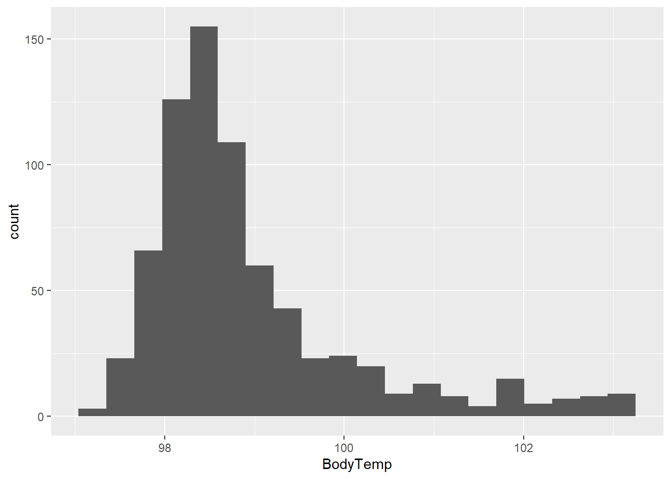
I’m also interested in the intensity variables… Let’s make a box plot of a couple of these with BodyTemp.
flu %>% ggplot(aes(x= BodyTemp, y = Myalgia, color = Myalgia)) +
geom_boxplot() 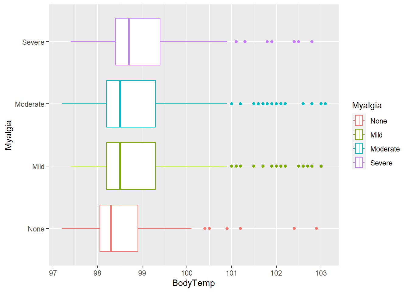
flu %>% ggplot(aes(x= BodyTemp, y = Weakness, color = Weakness)) +
  geom_boxplot()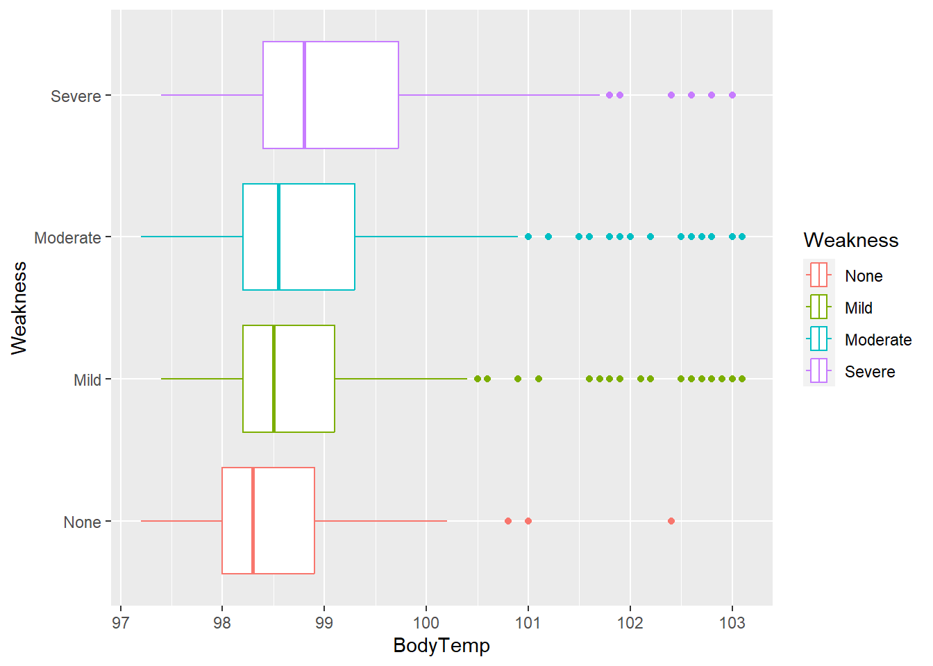
Median body temperature appears to increase with increasing intensity of myalgia/ weakness.
Let’s look at this as a histogram for weakness.
flu  %>% ggplot(aes(x = BodyTemp, fill = Weakness)) +
geom_histogram(bins = 20) 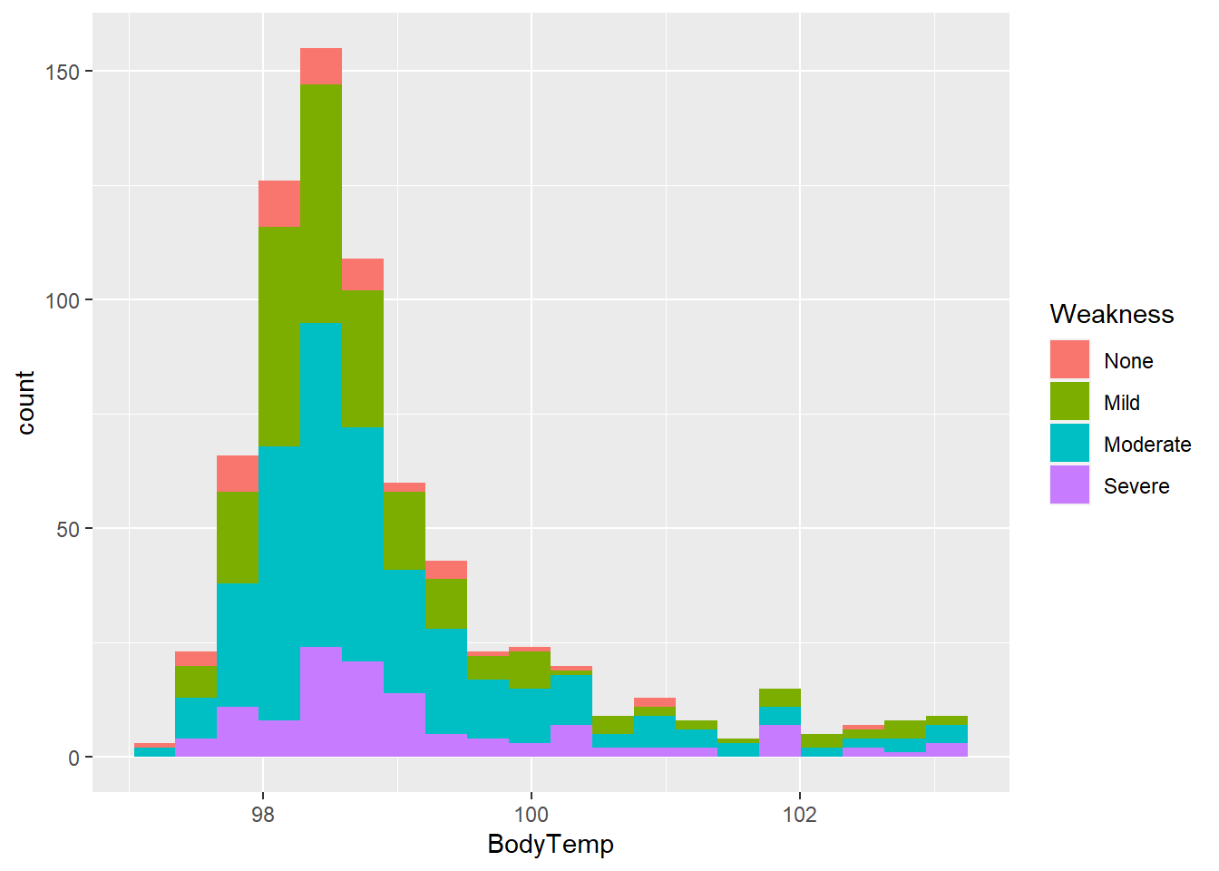
Weakness by Nausea contingency table
table(flu$Weakness,flu$Nausea)
            No Yes
  None      39  10
  Mild     172  51
  Moderate 210 128
  Severe    54  66
Myalgia by Nausea contingency table
table(flu$Myalgia,flu$Nausea)
            No Yes
  None      63  16
  Mild     159  54
  Moderate 198 127
  Severe    55  58
Cough Intensity by Nausea contingency table
table(flu$CoughIntensity,flu$Nausea)
            No Yes
  None      30  17
  Mild      99  55
  Moderate 232 125
  Severe   114  58
Now let’s take visualize this.
flu %>% ggplot(aes(x= Weakness, fill = CoughIntensity)) +
  geom_histogram(stat="count")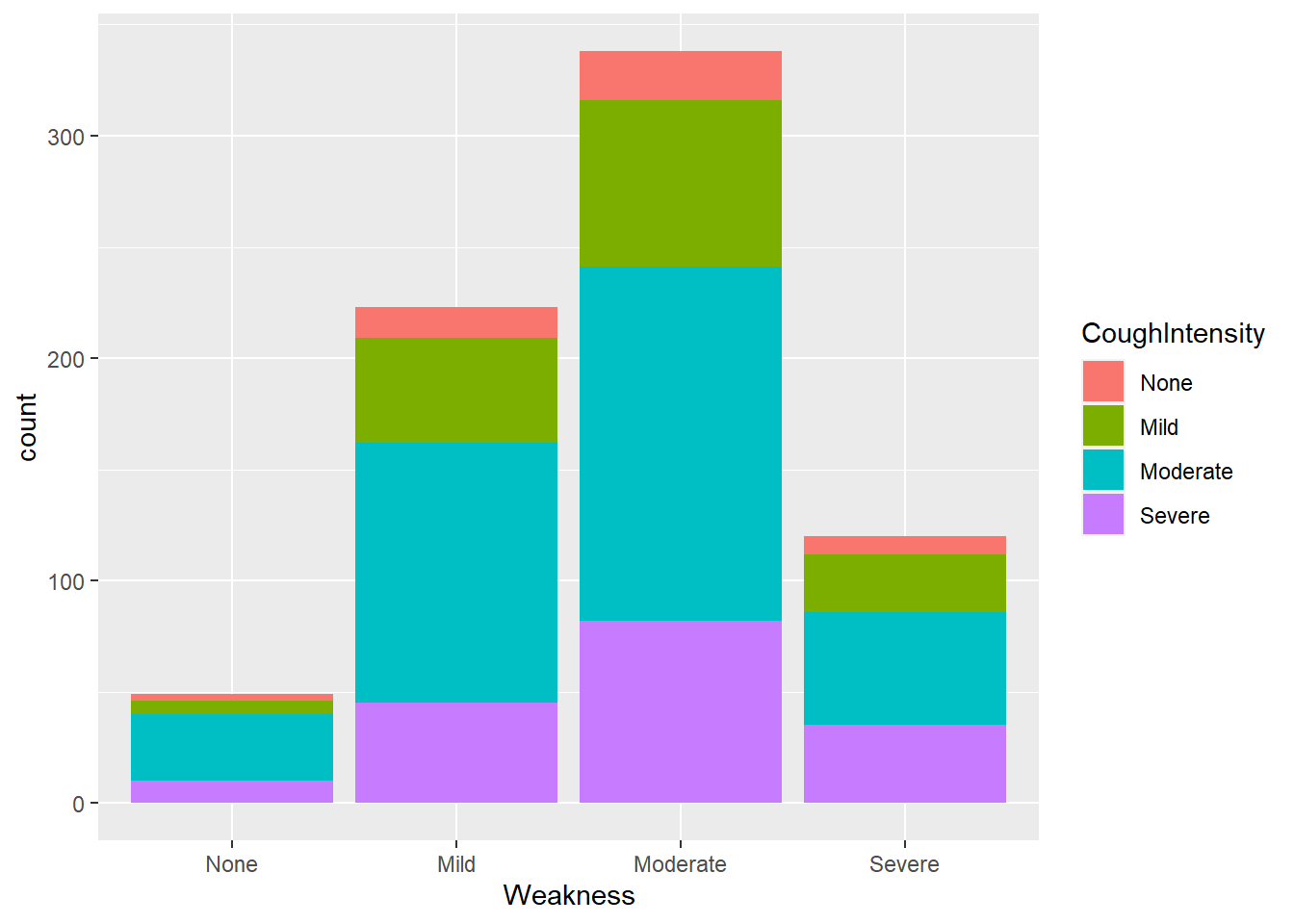
flu %>% ggplot(aes(x= Weakness, fill = Myalgia)) +
  geom_histogram(stat="count")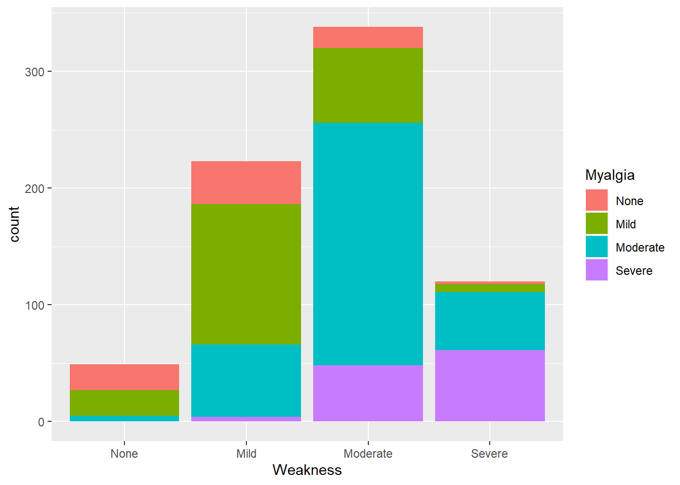
flu %>% ggplot(aes(x= Weakness, fill = Nausea)) +
  geom_histogram(stat="count")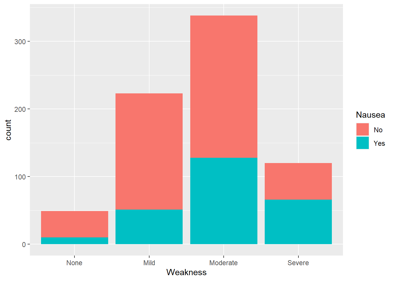
Weakness by Nausea contingency table
table(flu$Weakness,flu$Myalgia)
           None Mild Moderate Severe
  None       22   22        5      0
  Mild       37  120       62      4
  Moderate   18   64      208     48
  Severe      2    7       50     61